Fancy Fonts, Fancy Profits
Restaurants using fancy typeface on their menus can often get away with fancy prices too, because people perceive complicated fonts to mean complex foods that need greater skill to prepare according to a U.S. study.
Researchers Hyunjin Song and Norbert Schwarz, from the University of Michigan writing in the October issue of Psychological Science have concluded from research that small changes in the fonts on a menu can significantly alter people's perception of the food they are ordering, including its value.
"People infer that if something on a menu is difficult to understand or hard to read that it takes great skill and effort to prepare," says Song. Likewise, Song reports using an offbeat font to obscure a dish's description may signal hidden value to an unsuspecting diner on unfamiliar ground.
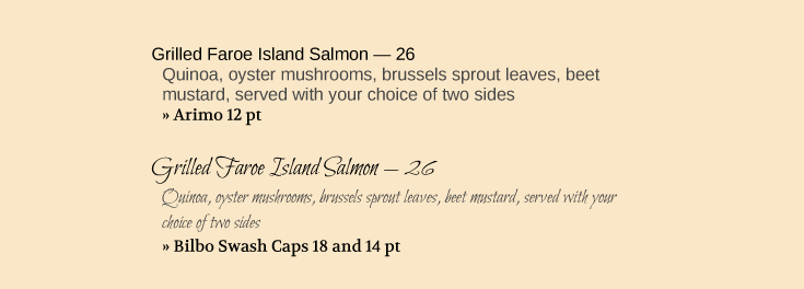
Plain vs Fancy: which looks harder to prepare?
This would explain the logic and trend of restaurants offering exorbitant entrées printed on menus with scripted fonts in microscopic print. So commonplace is this trend, that some restaurants in New York City now offer reading glasses for diners who need them. They do so, not because their menus are poorly designed, which they are not, but because some guests, particularly those with declining visions, are now used to using reading glasses to read menus with fine print.
Song's experiments compared subjects responses to identical menu item descriptions in the font Arial (a standard Windows font) and the harder-to-read Mistral font. Subjects in the latter case were more likely to conclude that the dish required great skill and was harder to prepare.
Song reports that, based on her findings, she might recommend that if restaurant owners want to give consumers the impression that their food is complex and of special value, they should consider styling their menus accordingly.
Not everyone is in agreement with Song's findings. Some restaurant marketing professionals believe fancy fonts, although they suggest sophistication, can also be pretentious and unapproachable. They argue type that is readable can boost sales for certain types of restaurants, including those that serve primarily organic food, where customers tend to value an easy-to-read font more highly.
i With iMenuPro, fonts are pre-selected with a Menu Style but you can override any pre-selected font using the Fonts menu. There are dozens of "fancy" fonts to choose from including Bilbo Swash Caps featured above.