Using Headline Fonts in ALL CAPS
iMenuPro menu styles all come with pre-selected fonts. So if you're using the fonts that come with the style, you can ignore this tip.
But if you have decided to change the fonts, or are using all caps - this tip is you! Because you should be careful using ALL CAPS for certain script fonts in the app (and in general for any design task). As doing so can significantly impair readability and the aesthetic appeal of you menu.
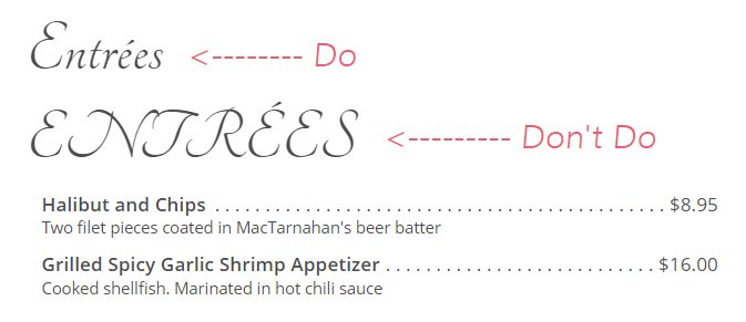
Script fonts are inherently designed to emulate handwriting or calligraphy, with varying degrees of flourish and intricacy. When presented in uppercase throughout, the unique character and flow of the font can become obscured.
In all caps, the overlaps, loops, and swashes that often define these fonts can blend together, making it difficult for readers to distinguish individual letters or words. This not only strains the eyes but also distracts from the content's message. That's the last thing you want on your menu.
For effective menu design, it's crucial to prioritize clarity and legibility, especially in headline fonts which are meant to quickly capture the diner's attention. Using script fonts in all caps can defeat this purpose and make your menu look poorly designed.